• CV
  • Contact
  • Italiano
  • CV
  • Contact
  • Italiano

Content Design › Tate

Onboarding

Sole content designer, working alongside a UX designer and a growth product manager.

Activating an energy supply can be complicated. People were dropping out halfway through the process and contacting customer support to complete it. The redesigned onboarding flow aimed to help more people complete the process on their own and reduce the need for support.

Following my work, support requests dropped significantly and more people completed the activation process without assistance.

Screen listing the three requirements for the current energy supply, with the buttons È proprio così and Non è il mio caso
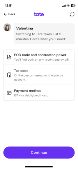
Screen showing how long switching takes and the three pieces of information to have at hand
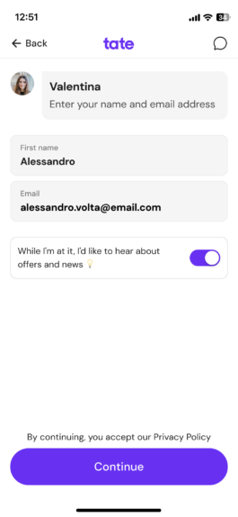
Name and email screen with the marketing consent written in the user’s voice
Onboarding screen 4 of 20: account holder
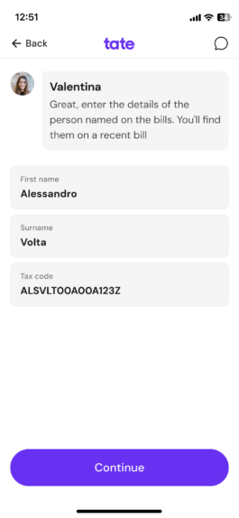
Onboarding screen 5 of 20: account holder’s details
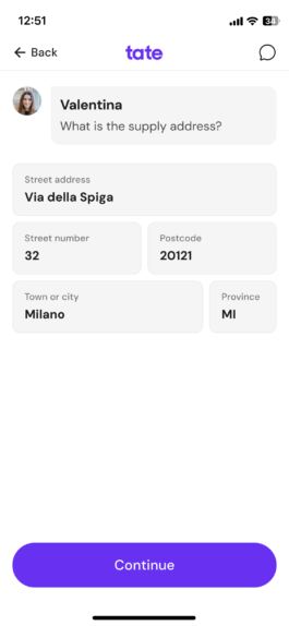
Onboarding screen 6 of 20: supply address
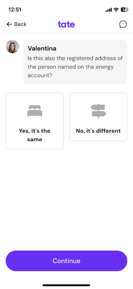
Screen asking whether the supply address is also the registered address, with the answers Sì, è lo stesso and No, è diverso
Onboarding screen 8 of 20: saving your details
Onboarding screen 9 of 20: pod code and power
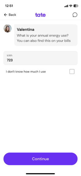
Onboarding screen 10 of 20: annual energy use
Onboarding screen 11 of 20: owner or tenant
Choice between card and bank account, with a link asking why paying by postal payment slip isn’t possible
Onboarding screen 13 of 20: card details
Onboarding screen 14 of 20: legal consents
Onboarding screen 15 of 20: summary
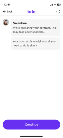
Onboarding screen 16 of 20: preparing the contract
Onboarding screen 17 of 20: mobile number
Onboarding screen 18 of 20: sms code
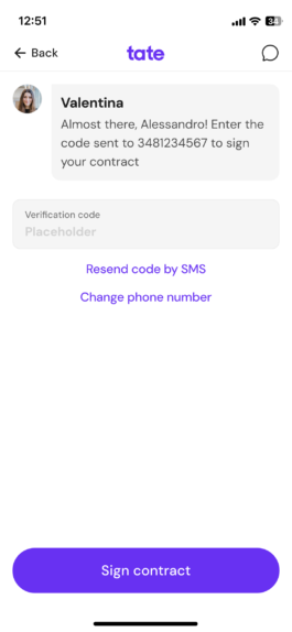
Onboarding screen 19 of 20: verification code
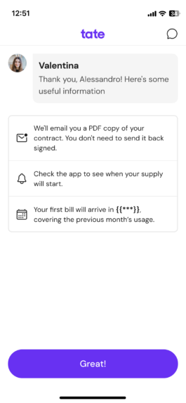
Onboarding screen 20 of 20: confirmation

01

Screen listing the three requirements for the current energy supply, with the buttons È proprio così and Non è il mio caso

Clear requirements before you start

I made the requirements clear at the start of the journey, so people wouldn’t go through several steps before finding out they weren’t eligible. The responses feel like part of a conversation rather than a form to fill in.
02

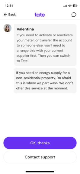
Screen explaining when it isn’t possible to switch to Tate, with the buttons Ok, grazie and Contatta l’assistenza

Saying no, transparently

Turning away a potential customer isn’t easy, but being transparent is essential to avoid wasting anyone’s time, including the team’s. With “I’m afraid this is where we part ways”, I wanted to communicate the limitation directly without losing the brand’s tone of voice.

03

Screen showing how long switching takes and the three pieces of information to have at hand

What you need, before you begin

Before getting started, I explained how long the process would take, what information people would need and where to find it. The goal was to reduce interruptions during activation.

04

Screen asking whether the supply address is also the registered address, with the answers Sì, è lo stesso and No, è diverso

One question, three details

Three things to distinguish in a single question: the supply address, the registered address and the account holder. To make the options easier to understand, I echoed part of the question in the responses, making them clearer than a simple “Yes” or “No”. Sometimes, an extra word in the interface means one less thing for the user to think about.
05

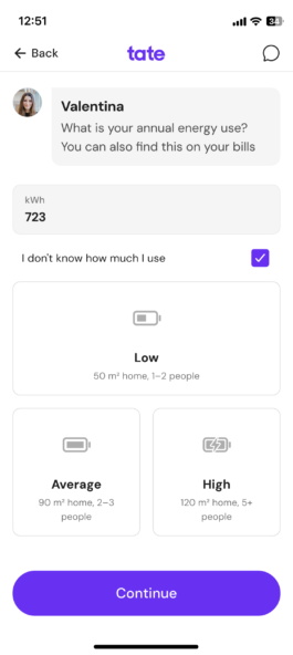
Annual energy use screen with three estimate options: low, average and high

An estimate for those who don’t know

The onboarding flow asked people to enter their annual energy consumption in kWh, a figure not everyone knows. For those who didn’t have a bill at hand, we offered a way to estimate it using more familiar information: the size of their home and the number of people living there. Less accurate, but enough to move forward.
06

Choice between card and bank account, with a link asking why paying by postal payment slip isn’t possible
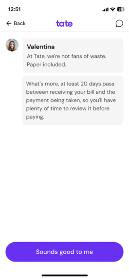
Answer to the question about postal payment slips

A limitation becomes a value

Paying by postal payment slip wasn’t an option, and this limitation needed to be communicated clearly. I connected it to Tate’s commitment to reducing paper waste, alongside a practical benefit of automatic payments. With “Sounds good to me”, people aren’t simply acknowledging the decision: they’re also given a chance to identify with the values behind it.

07

Name and email screen with the marketing consent written in the user’s voice

Consent in the user’s voice

Instead of the usual consent statement written from the company’s perspective, I wrote it in the user’s own voice: “While I’m at it…”. Even a secondary choice, such as opting in to marketing communications, can reflect Tate’s tone of voice.
The full flow

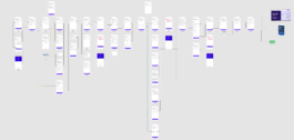
The screens in the main journey show only part of the onboarding flow I worked on. This flowchart shows the entire process, including all branches and alternative paths.

Full onboarding flow, with screens connected by arrows. Open the image to enlarge it.

Content Design › Tate

Onboarding

Sole content designer, working alongside a UX designer and a growth product manager.

Activating an energy supply can be complicated. People were dropping out halfway through the process and contacting customer support to complete it. The redesigned onboarding flow aimed to help more people complete the process on their own and reduce the need for support.

Following my work, support requests dropped significantly and more people completed the activation process without assistance.

Screen listing the three requirements for the current energy supply, with the buttons È proprio così and Non è il mio caso
Screen showing how long switching takes and the three pieces of information to have at hand
Name and email screen with the marketing consent written in the user’s voice
Onboarding screen 4 of 20: account holder
Onboarding screen 5 of 20: account holder’s details
Onboarding screen 6 of 20: supply address
Screen asking whether the supply address is also the registered address, with the answers Sì, è lo stesso and No, è diverso
Onboarding screen 8 of 20: saving your details
Onboarding screen 9 of 20: pod code and power
Onboarding screen 10 of 20: annual energy use
Onboarding screen 11 of 20: owner or tenant
Choice between card and bank account, with a link asking why paying by postal payment slip isn’t possible
Onboarding screen 13 of 20: card details
Onboarding screen 14 of 20: legal consents
Onboarding screen 15 of 20: summary
Onboarding screen 16 of 20: preparing the contract
Onboarding screen 17 of 20: mobile number
Onboarding screen 18 of 20: sms code
Onboarding screen 19 of 20: verification code
Onboarding screen 20 of 20: confirmation

01

Screen listing the three requirements for the current energy supply, with the buttons È proprio così and Non è il mio caso

Clear requirements before you start

I made the requirements clear at the start of the journey, so people wouldn’t go through several steps before finding out they weren’t eligible. The responses feel like part of a conversation rather than a form to fill in.

02

Screen explaining when it isn’t possible to switch to Tate, with the buttons Ok, grazie and Contatta l’assistenza

Saying no, transparently

Turning away a potential customer isn’t easy, but being transparent is essential to avoid wasting anyone’s time, including the team’s. With “I’m afraid this is where we part ways”, I wanted to communicate the limitation directly without losing the brand’s tone of voice.

03

Screen showing how long switching takes and the three pieces of information to have at hand

What you need, before you begin

Before getting started, I explained how long the process would take, what information people would need and where to find it. The goal was to reduce interruptions during activation.

04

Screen asking whether the supply address is also the registered address, with the answers Sì, è lo stesso and No, è diverso

One question, three details

Three things to distinguish in a single question: the supply address, the registered address and the account holder. To make the options easier to understand, I echoed part of the question in the responses, making them clearer than a simple “Yes” or “No”. Sometimes, an extra word in the interface means one less thing for the user to think about.

05

Annual energy use screen with three estimate options: low, average and high

An estimate for those who don’t know

The onboarding flow asked people to enter their annual energy consumption in kWh, a figure not everyone knows. For those who didn’t have a bill at hand, we offered a way to estimate it using more familiar information: the size of their home and the number of people living there. Less accurate, but enough to move forward.

06

Choice between card and bank account, with a link asking why paying by postal payment slip isn’t possible
Answer to the question about postal payment slips

A limitation becomes a value

Paying by postal payment slip wasn’t an option, and this limitation needed to be communicated clearly. I connected it to Tate’s commitment to reducing paper waste, alongside a practical benefit of automatic payments. With “Sounds good to me”, people aren’t simply acknowledging the decision: they’re also given a chance to identify with the values behind it.

07

Name and email screen with the marketing consent written in the user’s voice

Consent in the user’s voice

Instead of the usual consent statement written from the company’s perspective, I wrote it in the user’s own voice: “While I’m at it…”. Even a secondary choice, such as opting in to marketing communications, can reflect Tate’s tone of voice.

The full flow

The screens in the main journey show only part of the onboarding flow I worked on. This flowchart shows the entire process, including all branches and alternative paths.

Full onboarding flow, with screens connected by arrows. Open the image to enlarge it.