
Content Design › Tate
Sole content designer, working alongside a UX designer and a growth product manager.
To increase referrals, we conducted user research. Many people were happy with Tate but hesitated to recommend it, worried they’d come across as only interested in getting a discount. Yet discounts on energy bills were the incentive they valued most. My hypothesis was that we could overcome this reluctance by shifting the focus from financial rewards to the value of a genuine recommendation, while making the process simpler and more personal.
After launch, referrals increased significantly, to the point that the team was able to shift its focus to other priorities.
A name that changes perspective
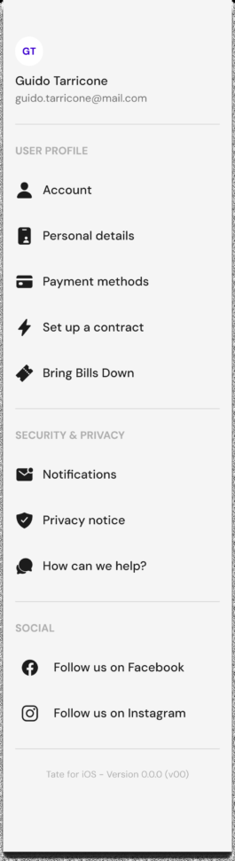
The name of the programme changes how people perceive it: from “Refer and save”, which focused on the financial reward, to “Bring Bills Down”, which suggests a useful action and uses less loaded language. This was the first application of my hypothesis.
The recipient’s benefit first
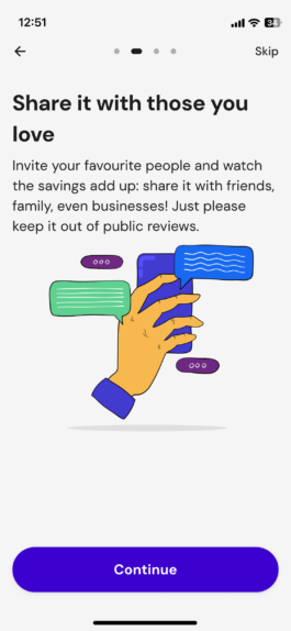
The first tutorial screen flips the usual perspective of a referral programme: instead of leading with what the person making the referral gets, it puts the recipient’s benefit first. The financial reward stays the same for both, but the way it’s presented changes.
A call to action, not a slogan
The previous version used the headline “Your friends are our friends too”. I turned this generic statement into a more specific instruction, making it clear that discounts can be combined and encouraging people to take action.
The recommendation comes first
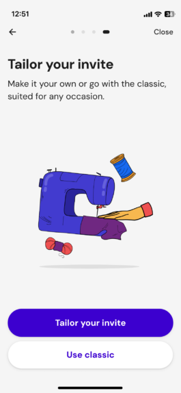
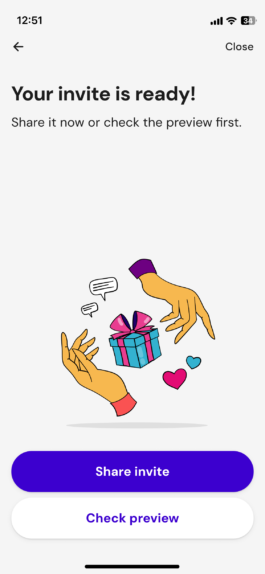
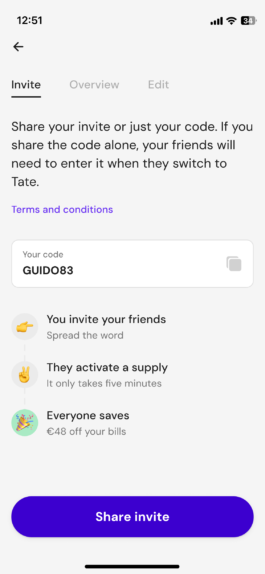
This screen captures the heart of the strategy. Being happy with Tate becomes the reason to recommend it: you’re not inviting someone just to get a discount, but to share a positive experience. The financial reward is still there, but it comes second. “Anything else is a bonus” gets this across with a light touch.
A warning with a smile
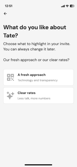
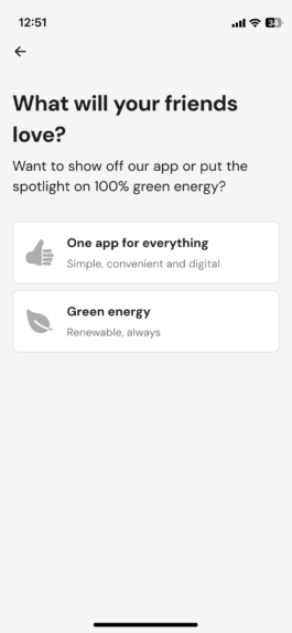
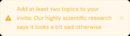
The dashboard lets people choose which aspects of Tate to highlight in their invitation. To prevent the final message from looking too bare, we added a playful warning encouraging them to select at least two topics. Even a small detail like this can be an opportunity to express the brand’s tone of voice.
Error messages that raise a smile
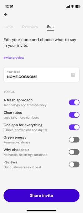
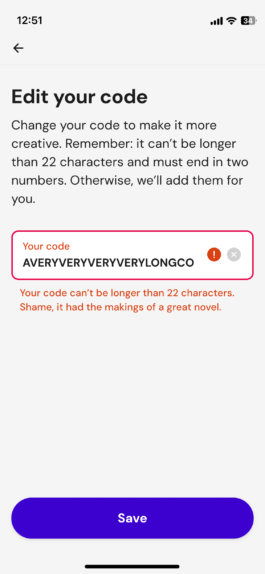
Customising the referral code is another way to make the process feel lighter and less transactional. I explained the requirements upfront to help prevent errors. But when someone enters a code that’s already taken, too long or contains prohibited words, the error message explains the problem while trying to raise a smile.
Two ways to the same action
I wrote in-app notifications to encourage existing Tate customers to take part in the referral programme. “Think of your friends” highlights the value of a recommendation, while “Bring Bills Down” reinforces the programme’s new name. Two different ways to encourage the same action without focusing solely on the reward.
An invitation from a person, not a company
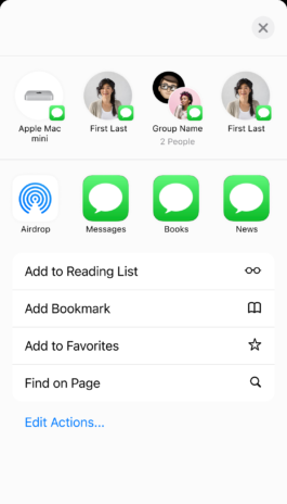
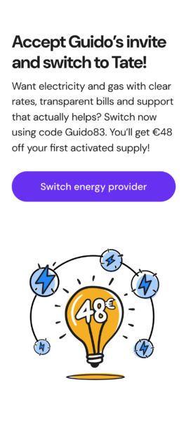
The SMS sent to the person receiving the invitation feels more personal: it includes the name of the person recommending Tate and uses the first person, rather than sounding like a message from the company. The financial benefit remains explicit, but it’s clear who the invitation comes from.
The main journey shows only part of the referral programme. This flowchart maps out the entire process: entry points from the profile and notifications, the tutorial, invitation customisation, the dashboard, sharing and the landing page for recipients.
Content Design › Tate
Sole content designer, working alongside a UX designer and a growth product manager.
To increase referrals, we conducted user research. Many people were happy with Tate but hesitated to recommend it, worried they’d come across as only interested in getting a discount. Yet discounts on energy bills were the incentive they valued most. My hypothesis was that we could overcome this reluctance by shifting the focus from financial rewards to the value of a genuine recommendation, while making the process simpler and more personal.
After launch, referrals increased significantly, to the point that the team was able to shift its focus to other priorities.
A name that changes perspective
The name of the programme changes how people perceive it: from “Refer and save”, which focused on the financial reward, to “Bring Bills Down”, which suggests a useful action and uses less loaded language. This was the first application of my hypothesis.
The recipient’s benefit first
The first tutorial screen flips the usual perspective of a referral programme: instead of leading with what the person making the referral gets, it puts the recipient’s benefit first. The financial reward stays the same for both, but the way it’s presented changes.
A call to action, not a slogan
The previous version used the headline “Your friends are our friends too”. I turned this generic statement into a more specific instruction, making it clear that discounts can be combined and encouraging people to take action.
The recommendation comes first
This screen captures the heart of the strategy. Being happy with Tate becomes the reason to recommend it: you’re not inviting someone just to get a discount, but to share a positive experience. The financial reward is still there, but it comes second. “Anything else is a bonus” gets this across with a light touch.
A warning with a smile
The dashboard lets people choose which aspects of Tate to highlight in their invitation. To prevent the final message from looking too bare, we added a playful warning encouraging them to select at least two topics. Even a small detail like this can be an opportunity to express the brand’s tone of voice.
Error messages that raise a smile
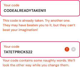
Customising the referral code is another way to make the process feel lighter and less transactional. I explained the requirements upfront to help prevent errors. But when someone enters a code that’s already taken, too long or contains prohibited words, the error message explains the problem while trying to raise a smile.
Two ways to the same action
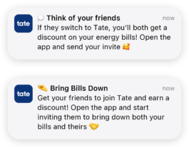
I wrote in-app notifications to encourage existing Tate customers to take part in the referral programme. “Think of your friends” highlights the value of a recommendation, while “Bring Bills Down” reinforces the programme’s new name. Two different ways to encourage the same action without focusing solely on the reward.
An invitation from a person, not a company
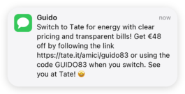
The SMS sent to the person receiving the invitation feels more personal: it includes the name of the person recommending Tate and uses the first person, rather than sounding like a message from the company. The financial benefit remains explicit, but it’s clear who the invitation comes from.
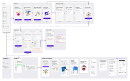
The main journey shows only part of the referral programme. This flowchart maps out the entire process: entry points from the profile and notifications, the tutorial, invitation customisation, the dashboard, sharing and the landing page for recipients.