Content Design › Tate
Sole content designer, working alongside a UX designer and a growth product manager.
A test on the homepage revealed that users couldn’t immediately tell whether Tate was an energy supplier or a price comparison service. A content audit also showed that the brand’s voice was inconsistent across much of the website.
I rebuilt Tate’s tone of voice by interviewing the founders, marketing team, developers and, above all, customer support: the people who hear how customers actually speak and where they get stuck every day. From these conversations, I identified the voice and tone Tate was already using without having defined them, refined both and applied them across the entire customer journey.
Redesigning just the first two sections led to a 25% increase in sign-ups and 19% more CTA clicks. Based on these results, the project was extended to the entire website and expanded to include a redesign of the visual identity.
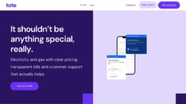
A headline that sparks curiosity
I took a calculated risk by writing a headline that was paradoxically less informative than the previous one. As well as positioning the brand, it sparked curiosity and encouraged people to read the subheading, where the service and mission become clear, completing the thought left hanging in the headline. The results showed that the risk paid off.

Transparency, front and centre
The previous version focused on the shortcomings of other energy suppliers. The new one highlights one of Tate’s strengths: transparency.

Pricing explained in two parts
The other critical section explained the “PUN + fixed fee” pricing model, which few other suppliers offered at the time, making it unfamiliar to customers. The previous wording gave the misleading impression that Tate charged a fixed monthly amount, like some competitors. The new copy explains the pricing model more clearly and is also more consistent with the brand’s voice.
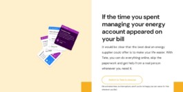
Time as the promise
Like the main headline, this one is only completed by the text that follows. Tate never claims to be the cheapest supplier, but the clearest. The promise goes beyond price: time is money, too.

Support with a human touch
Another of Tate’s strengths is its customer support: fast, understanding and human. The contrast with the call centre experience offered by larger companies makes its value clear.
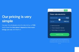
The same pricing, in two sentences
The same pricing model explained on the homepage, summed up in just two sentences. Proof that it really is that simple.
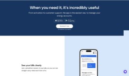
An app for the moments that matter
Rather than promising an app you’ll use every day, the headline tells the truth: it’s useful when it matters.
Content Design › Tate
Sole content designer, working alongside a UX designer and a growth product manager.
A test on the homepage revealed that users couldn’t immediately tell whether Tate was an energy supplier or a price comparison service. A content audit also showed that the brand’s voice was inconsistent across much of the website.
I rebuilt Tate’s tone of voice by interviewing the founders, marketing team, developers and, above all, customer support: the people who hear how customers actually speak and where they get stuck every day. From these conversations, I identified the voice and tone Tate was already using without having defined them, refined both and applied them across the entire customer journey.
Redesigning just the first two sections led to a 25% increase in sign-ups and 19% more CTA clicks. Based on these results, the project was extended to the entire website and expanded to include a redesign of the visual identity.
A headline that sparks curiosity
I took a calculated risk by writing a headline that was paradoxically less informative than the previous one. As well as positioning the brand, it sparked curiosity and encouraged people to read the subheading, where the service and mission become clear, completing the thought left hanging in the headline. The results showed that the risk paid off.
Transparency, front and centre
The previous version focused on the shortcomings of other energy suppliers. The new one highlights one of Tate’s strengths: transparency.
Pricing explained in two parts
The other critical section explained the “PUN + fixed fee” pricing model, which few other suppliers offered at the time, making it unfamiliar to customers. The previous wording gave the misleading impression that Tate charged a fixed monthly amount, like some competitors. The new copy explains the pricing model more clearly and is also more consistent with the brand’s voice.
Time as the promise
Like the main headline, this one is only completed by the text that follows. Tate never claims to be the cheapest supplier, but the clearest. The promise goes beyond price: time is money, too.
Support with a human touch
Another of Tate’s strengths is its customer support: fast, understanding and human. The contrast with the call centre experience offered by larger companies makes its value clear.
The same pricing, in two sentences
The same pricing model explained on the homepage, summed up in just two sentences. Proof that it really is that simple.
An app for the moments that matter
Rather than promising an app you’ll use every day, the headline tells the truth: it’s useful when it matters.