• CV
  • Contact
  • Italiano
  • CV
  • Contact
  • Italiano

Content Design › EE

Preventing duplicate requests

Content designer, working with a UX designer, scrum master and product owner.

The data showed that many device updates were failing because people were submitting the same request again before processing was complete.

My hypothesis was that it was not clear enough when an update was in progress or how long it would take. The problem was urgent, but the team did not have the capacity to change the structure of the platform. We therefore focused on the interface content to prevent people from submitting the same request again.

50% fewer failed updates. After our changes, the proportion of failed updates gradually fell and stabilised at a level 50% lower than before.

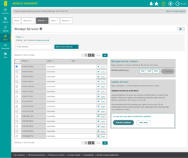
Update services con il messaggio di conferma: tempi fino a 24 ore in evidenza e i bottoni Submit updates e Not now

I prioritised the most important information

The previous message contained a lot of information without a clear hierarchy and did not give enough prominence to processing times. I simplified the copy and reorganised the information, highlighting what people needed to decide how to proceed. I then rewrote the CTA so that the action would be clear even at a glance.
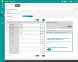
Vecchia conferma di Update services: un lungo testo e i bottoni Yes e No
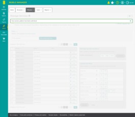
Messaggio di conferma: Your service updates have been submitted

I removed ambiguity

I also rewrote the submission confirmation. The previous version, “Your service updates have been successfully submitted”, confirmed that the request had been submitted, but a quick reading could suggest that the update itself had already been completed. Removing “successfully” avoided this ambiguity.
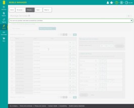
Vecchio messaggio: Your service updates have been successfully submitted
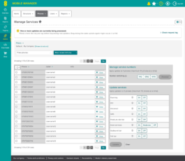
Manage Services con l’avviso giallo che segnala aggiornamenti ancora in elaborazione e il link Check request log

We made updates in progress visible

An organisation’s mobile fleet may be managed by several people. Someone using the platform might therefore be unaware that a colleague had already requested an update. We designed a banner to show that updates were being processed and prompt people to check the request log before submitting new requests.
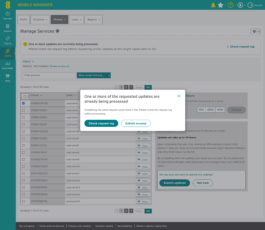
Finestra di dialogo che avvisa che lo stesso aggiornamento è già in elaborazione, con i bottoni Check request log e Submit anyway

We warned users before they submitted a duplicate request

When someone requests an update that is already being processed, a more prominent message warns them again about the possible consequences. It lets them choose whether to check the request log or submit the request anyway.
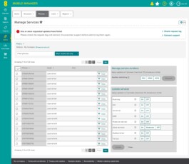
Manage Services con l’avviso rosso che segnala aggiornamenti non riusciti, con i link Check request log e Contact support

We clarified what to do after an update failed

When an update failed, many users understandably submitted the request again. However, a technical issue meant that submitting a new request for an update that had already failed could cause all subsequent requests to fail too. We therefore designed a banner that flags failed updates and tells people to contact customer support before trying again.

What we observed next

The work resolved an urgent problem, but also revealed other difficulties with service management. CTAs for different actions were inconsistent, some names did not clearly explain the available functions, and information about the selected devices could be confusing. These observations, later confirmed by qualitative research, helped initiate a broader redesign, starting with the network features.

Content Design › EE

Preventing duplicate requests

Content designer, working with a UX designer, scrum master and product owner.

The data showed that many device updates were failing because people were submitting the same request again before processing was complete.

My hypothesis was that it was not clear enough when an update was in progress or how long it would take. The problem was urgent, but the team did not have the capacity to change the structure of the platform. We therefore focused on the interface content to prevent people from submitting the same request again.

50% fewer failed updates. After our changes, the proportion of failed updates gradually fell and stabilised at a level 50% lower than before.

Update services con il messaggio di conferma: tempi fino a 24 ore in evidenza e i bottoni Submit updates e Not now

I prioritised the most important information

The previous message contained a lot of information without a clear hierarchy and did not give enough prominence to processing times. I simplified the copy and reorganised the information, highlighting what people needed to decide how to proceed. I then rewrote the CTA so that the action would be clear even at a glance.

Vecchia conferma di Update services: un lungo testo e i bottoni Yes e No
Messaggio di conferma: Your service updates have been submitted

I removed ambiguity

I also rewrote the submission confirmation. The previous version, “Your service updates have been successfully submitted”, confirmed that the request had been submitted, but a quick reading could suggest that the update itself had already been completed. Removing “successfully” avoided this ambiguity.

Vecchio messaggio: Your service updates have been successfully submitted
Manage Services con l’avviso giallo che segnala aggiornamenti ancora in elaborazione e il link Check request log

We made updates in progress visible

An organisation’s mobile fleet may be managed by several people. Someone using the platform might therefore be unaware that a colleague had already requested an update. We designed a banner to show that updates were being processed and prompt people to check the request log before submitting new requests.

Finestra di dialogo che avvisa che lo stesso aggiornamento è già in elaborazione, con i bottoni Check request log e Submit anyway

We warned users before they submitted a duplicate request

When someone requests an update that is already being processed, a more prominent message warns them again about the possible consequences. It lets them choose whether to check the request log or submit the request anyway.

Manage Services con l’avviso rosso che segnala aggiornamenti non riusciti, con i link Check request log e Contact support

We clarified what to do after an update failed

When an update failed, many users understandably submitted the request again. However, a technical issue meant that submitting a new request for an update that had already failed could cause all subsequent requests to fail too. We therefore designed a banner that flags failed updates and tells people to contact customer support before trying again.

What we observed next

The work resolved an urgent problem, but also revealed other difficulties with service management. CTAs for different actions were inconsistent, some names did not clearly explain the available functions, and information about the selected devices could be confusing. These observations, later confirmed by qualitative research, helped initiate a broader redesign, starting with the network features.